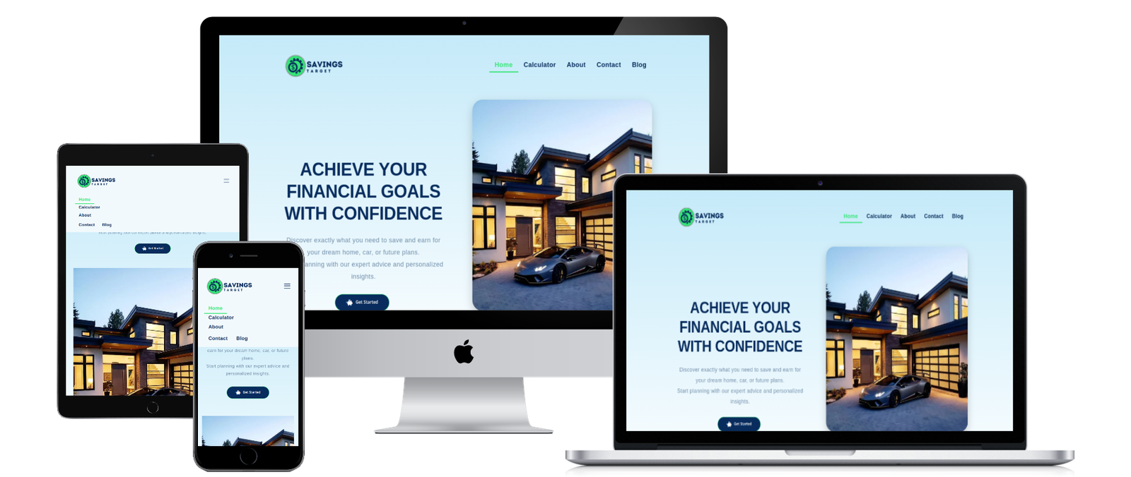
Overview
Savings Target needed a clear and compelling landing site to validate demand and capture leads. The initial draft mixed too many messages and lacked visual hierarchy.
The Challenge
- Unclear value proposition and scattered content reduced conversion.
- Trust signals and social proof were minimal.
- Performance and mobile layout needed work.
Strategy
- Clarify the core value prop and map features to user jobs‑to‑be‑done.
- Introduce trust (security, testimonials), concise FAQs, and strong CTA placement.
- Lean build with optimized assets and semantic structure for speed and SEO.
Execution
We delivered a sharp hero with clear CTA, modular feature blocks, and a focused page flow. We added social proof, FAQ, and a sticky CTA strip for mobile. Assets were optimized for a swift load.